Lesson deck
StatisticsFoundation
Choosing the best average
A dot plot shows whether there is an outlier. An outlier pulls the mean, so the median describes the group better; with no outlier the mean uses every value. Ends with bar charts of words, where only the mode works.
A free key stage 3 and GCSE Foundation statistics lesson on choosing the best average, spec code S5. It has a lesson deck to teach from with a visualiser, a worksheet with answers, a puzzle, an exit ticket and end of unit tests.
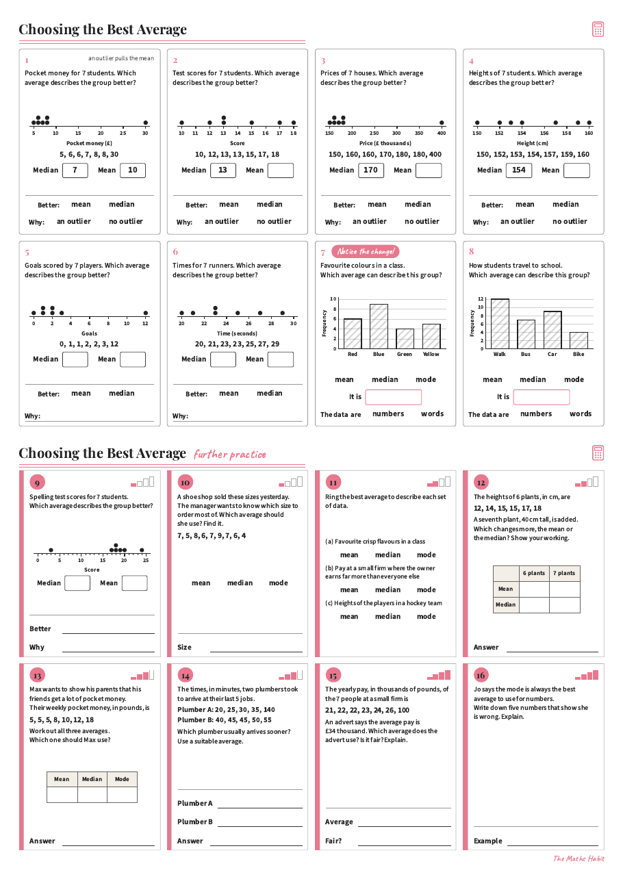
Foundation
Choosing the best average
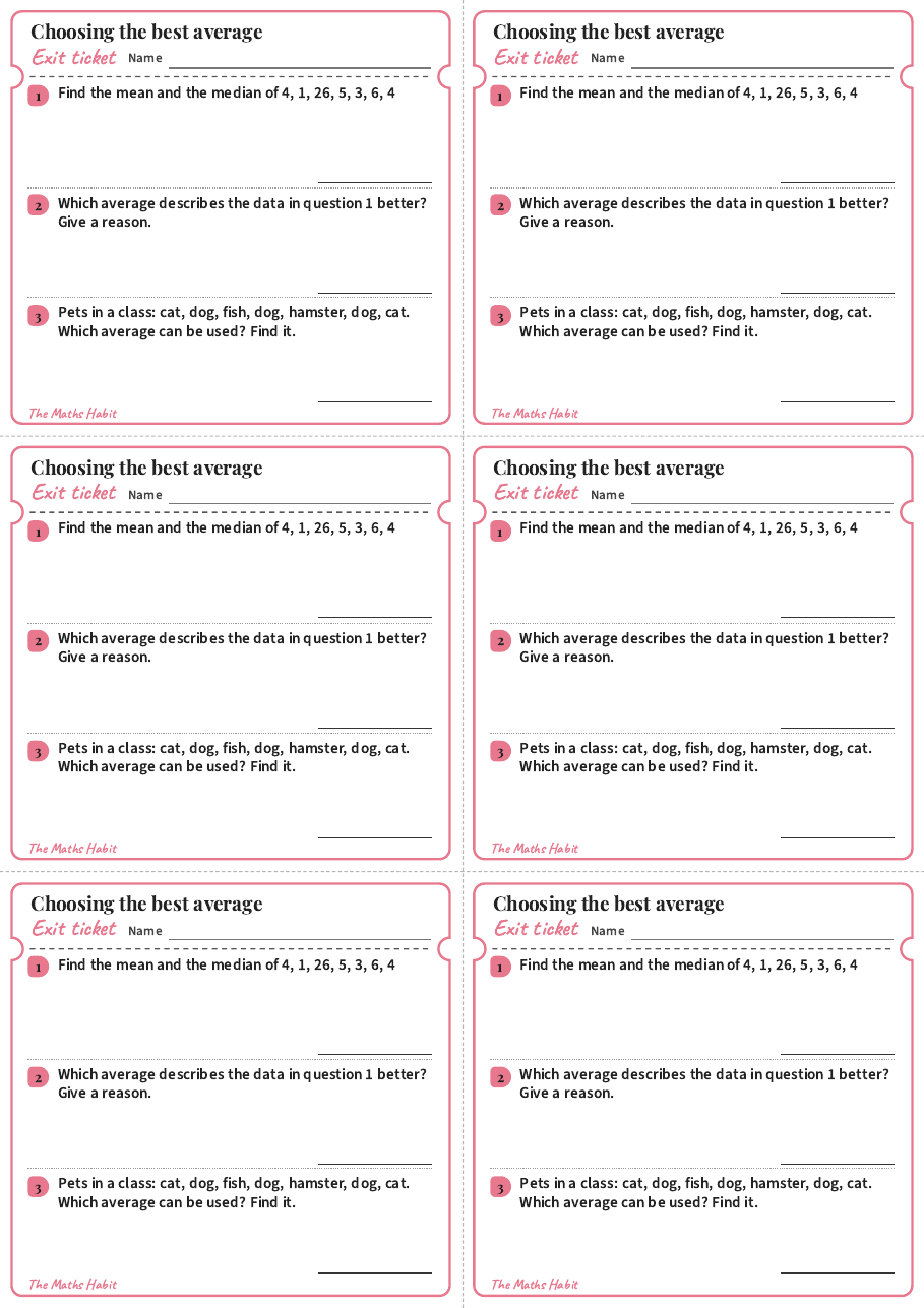
Exit ticket
Choosing the best average
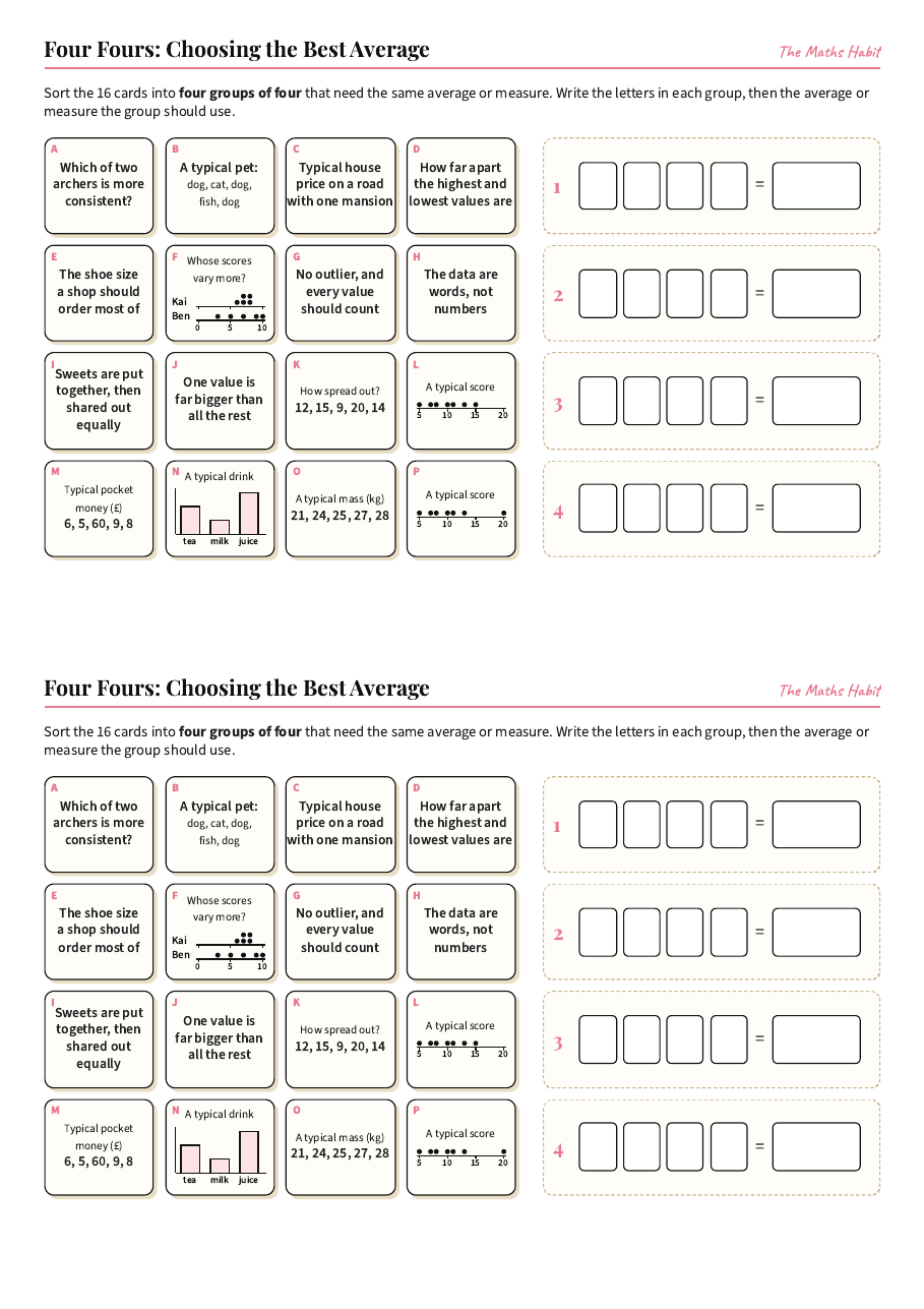
Puzzle
Four Fours:Choosing the best average
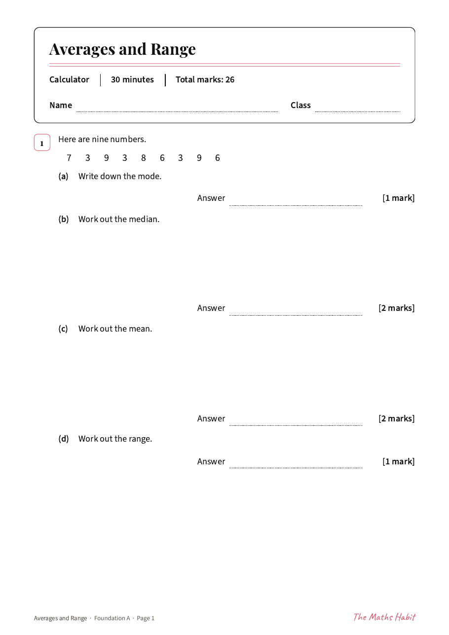
Test
Averages and range test:Foundation A
Test
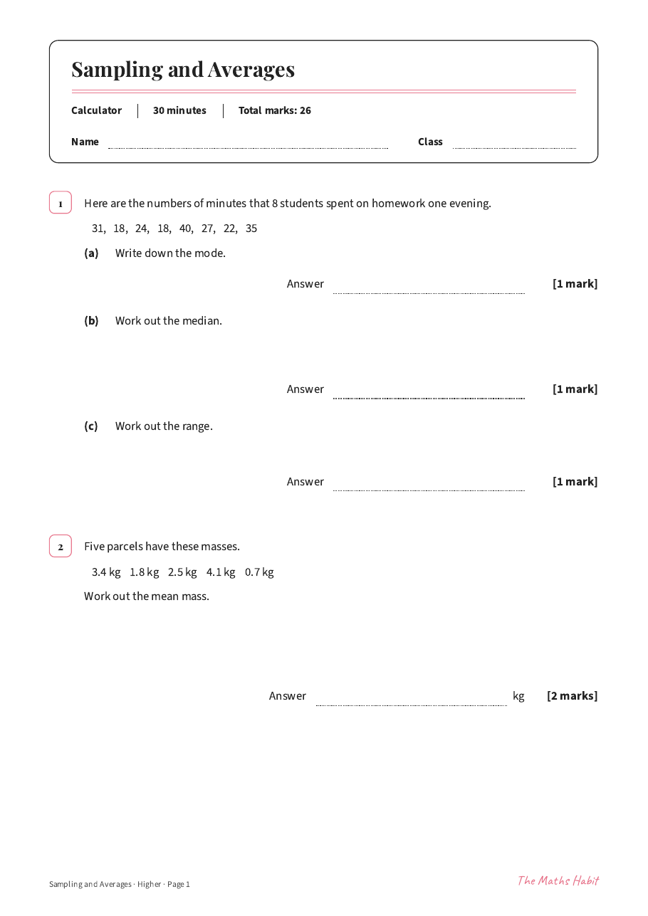
Sampling and averages test:Higher
More in Statistics
- Two-way tablesLesson · Foundation
- Drawing pie chartsLesson · Foundation
- Bar chartsLesson · Support
- Reading bar charts and pictogramsLesson · Support
- Bar chartsLesson · Foundation
- Comparative and composite bar chartsLesson · Foundation
- Line graphsLesson · Common
- Stem-and-leaf diagramsLesson · Foundation
- Median, mode and rangeLesson · Support
- The meanLesson · Support
- Code breaker: two-way tablesPuzzle
- Revision mat: probability, Foundation BRevision mat · Foundation
- Revision mat: probability, Foundation ARevision mat · Foundation
- Revision mat: probability, Higher ARevision mat · Higher